mirror of
https://github.com/BookStackApp/BookStack.git
synced 2026-07-17 13:43:50 +03:00
[2019 design] Mobile UI improvements #1180
Reference in New Issue
Block a user
Delete Branch "%!s()"
Deleting a branch is permanent. Although the deleted branch may continue to exist for a short time before it actually gets removed, it CANNOT be undone in most cases. Continue?
Originally created by @Bolthier on GitHub (May 10, 2019).
I really like the new design of the mobile experience. Not to mention the desktop design. There were just a few issues I experienced. So here are my cumulated thoughts on them.
Describe the feature you'd like
Replace Info Bar With Info Button - The content / info bar is a bit oversized with too much focus on it for the rather simple function it inherits. An improvement nonetheless but I would prefer a simple button in the navigation bar. On the homepage, books and shelves page the info button would be just between the main bar and the content. Would probably need some work to change how and where the navigation bar is implemented.

Hide/Show Menu On Scroll - It would be nice to have the navigation and menu bar pop out if scrolled up and hidden while scrolling down for both the desktop and mobile UI.

Update Editor Sidebar - The editor sidebar should get the same treatment as the info sidebar. With buttons replacing the text completely and the save button back in the editor bar. The save button right now gets in the way too much. Additionaly a button similar to the info button for switching to the tags/attachments.
Few bugs
Minor horizontal scrolling issue in shelves, books and chapters view once the viewport gets a bit smaller. Experienced on my OnePlus 3T (Viewport 412x732, pixel ratio: 2.625).

The sidebar font is grayed out in the info view. With touch devices you can't hover over them like on desktop. If possible the font should be fully colored once switched to the info sidebar through the info button.
Describe the benefits this feature would bring to BookStack users
Better use of space and a more consistent design of the sidebars. The other two issues are just minor design bugs, but I didn't want to create seperate issues for them.
And because I don't know where else to give some simple thanks: I love your new design and all of the work you put into this project!
@ssddanbrown commented on GitHub (May 27, 2019):
Thank you @Bolthier, Your kind words are very much appreciated.
In regards to the reported bugs, These should now be patched in master, Will be in the next patch release that should be going out today.
In regards to the design feedback, Thanks for clearly defining your points with examples, Here are my initial thoughts:
I agree the content/info tabs could do with improving but I'm worried a simple icon button may be to subtle. There are a lot of actions/links hidden on that separate view on mobile so I think it's important that the view switch is reinforced as an obvious UI element.
I can see the utility in a re-appearing nav such as this but I'm personally never that fond of that behaviour. Always feels like I have less control. Might just be how many websites implement this in a janky way though. We do have the 'Back-to-top' button at the moment. Although different functionality the uses of these would begin to overlap a bit.
Will have a think about save button, I wanted to make the action obvious and an easier touch target while not increasing vertical toolbar space used. Yeah, We should probably roll out the change of sidebar to tabs. Will probably need a new item in the sidebar for templates in the next planned feature release so might look to change this at the same time.
I'll mark this as open to discussion for now, since design bits can be quite opinionated & might be good to get input from others. Multi-point issues can be a little hard to manage so at a later date I may split this out into separate issues for remaining items.
@over-soul commented on GitHub (Apr 15, 2020):
Hi all,
I really like the mobile design as well, but the info tab is very large as mentioned and "info" is not a very accurate description of what is in that tab. You have very important page and book navigation in there as well as search, which I don't think match the label "info". I don't think most users would think to look under an "info" tab for book or page navigation.
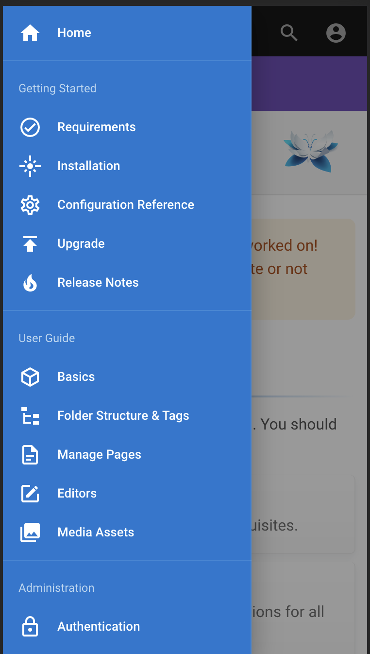
I personally really like how wiki.js handles this on mobile. The display a hamburger menu in the bottom left hand corner that you can tap on:
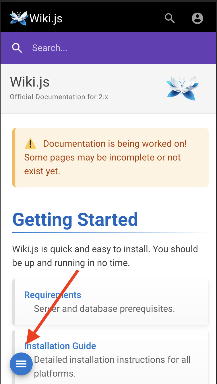
Which then slides into view a panel from the left:
I think people are used to clicking on these menus but I don't think they are used to "info" and it also takes away screen real estate that you really need on mobile.
@ssddanbrown commented on GitHub (Sep 8, 2025):
I'm going to go ahead and close this off since there's been little further development/discussion/desire on this, although some points may have also been raised via seperate existing threads.
Thanks still for the original feedback @over-soul and @Bolthier!